Genre
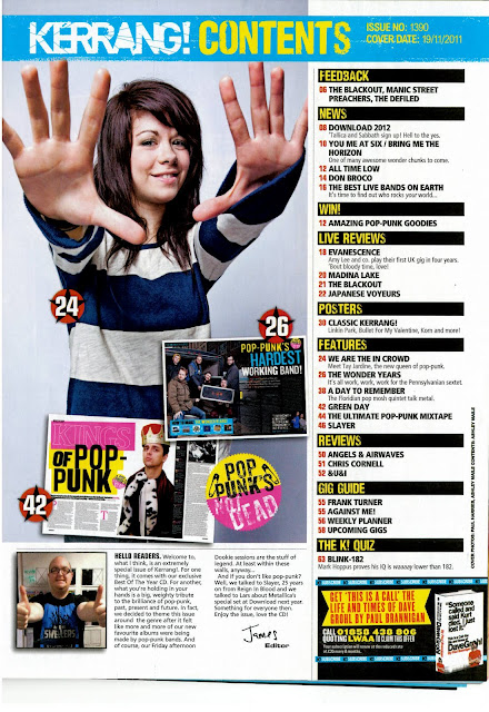
The genre of this magazine is alternative rock however I am quite suprised to see the amount of bright colours on the contents page as alternative is usually associated with dark colours however I feel like this makes it more eye catching. The large mid shot of the girl which takes up half of the page shows that it is alternative as she has quite stereotypical fringe/hairstyle which would be associated with this genre of music. Alot of the page is oriented around pop-punk style of music which may also explain the bright colours.
Target Audience
The target audience of this magazine is probably teenage girls who are more likely to buy music magazines. Also the girl on the cover may be to attract more teenage boys to read the magazine. The magazine also has sections such as posters and quizzes which will apeal to the younger teenage audience showing that this is the target audience.
Layout
Most of the page is taken up bu one large midshot with a few other images of the pages inside over it to give the reader a taste of what theyre getting before they even open the magazine. Also the different parts of the magazine have been split off into sections with bold headings and then the different pages with numbers underneath the apropriate catagory. This is to make it easier for the reader to find what they are looking for within the magazine, which is what a good contents page is for.
Representation
On the page is a girl who looks pretty young however I'm not sure if shes from a band or if shes a singer so she I dont really know who she is however it is a medium long shot and she has her arms out, probably just to make the picture look cooler. And then the page also has Green Day who are quite a big band, probably to attract attention, and suprisingly a picture of the editor and some writing from him.

No comments:
Post a Comment